
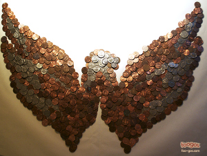
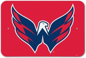
In the ongoing “Mongos” series, I’ve taken on the Washington Capitals, specifically focusing on their secondary logo, which I believe ranks among the best in all of sports. As much as I respect the Caps and their owner Ted Leonsis, who I generally think is doing a decent job, this series is all about poking fun at the NHL’s third labor dispute in 18 years.
The “hardliners” driving this latest conflict include owners from Boston, Minnesota, Calgary, and Washington. While I’ve wrapped up this portion of the series by giving the Caps logo the “Mongo” treatment, the fun doesn’t stop here. I’ll continue to playfully reimagine NHL logos, with potential targets including the Blues, Lightning, and Montreal. Their logos seem perfect for a Mongo makeover, though Nashville’s intimidating sabretooth tiger might have to wait its turn.
Stay tuned for more as I bring more of these logos to life in a way that’s both mocking and, I hope, entertaining.
The world of sports ownership is always rife with drama, especially when it comes to the NHL, where a handful of team owners have been pivotal in shaping the league’s landscape through labor disputes. Among the most influential figures in the recent labor negotiations are the owners of the Boston Bruins, Minnesota Wild, Calgary Flames, and Washington Capitals. While Ted Leonsis, owner of the Capitals, generally gets a decent reputation for his ownership style, his role in these labor talks places him among the so-called “hardliners” of the league.
As I dive into the creative project I’ve dubbed the “Mongos mockery of the No Hockey League,” I’m taking a playful, yet pointed jab at the logos of these teams, starting with the Capitals’ secondary logo. Now, don’t get me wrong—I think this logo is one of the best secondary logos in all of sports. It’s sleek, iconic, and represents the spirit of the team and the city. But that doesn’t mean it’s safe from my satirical lens.
With the “hardliners” now accounted for in this ongoing series, I’m moving on to the rest of the league’s logos. It’s not about targeting specific teams anymore; instead, it’s about exploring the ease with which some of these logos can be recreated—or rather, mocked up—using everyday items, maybe even “chump change.” Teams like the St. Louis Blues, Tampa Bay Lightning, and Montreal Canadiens have logos that immediately come to mind as being prime candidates for this treatment. Their simplicity makes them ideal for this kind of playful critique.
That said, not every team’s logo lends itself to this kind of reinterpretation. Take Nashville’s logo, for example. The sabretooth tiger is pretty intimidating, and replicating that with simple materials might be a challenge. But who knows? Maybe that’s where the fun lies—in tackling the unexpected and turning even the most ferocious logos into something whimsically mundane.
So, as I continue this series, expect the unexpected. The NHL logos are getting a new, less serious, and slightly irreverent look—because sometimes, even the most revered symbols in sports need a bit of light-hearted mockery.